Our Purpose
Our Mission
To provide innovative technology solutions that empower communities and drive sustainable development.
Our Vision
To be the leading technology partner in Africa, bridging the digital divide and creating opportunities for all.
Leadership
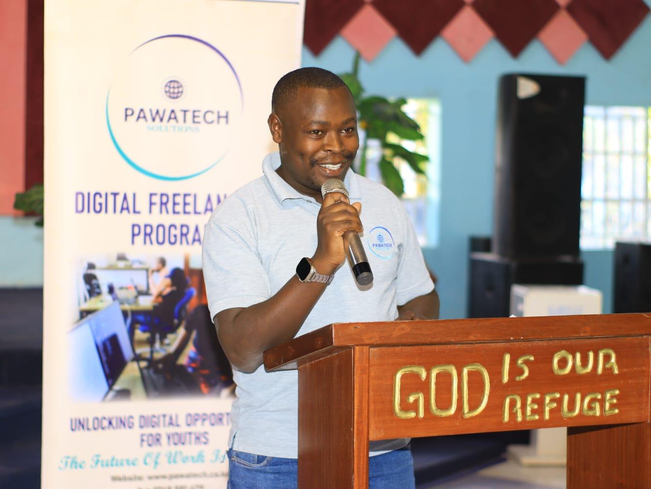
Message from the Director
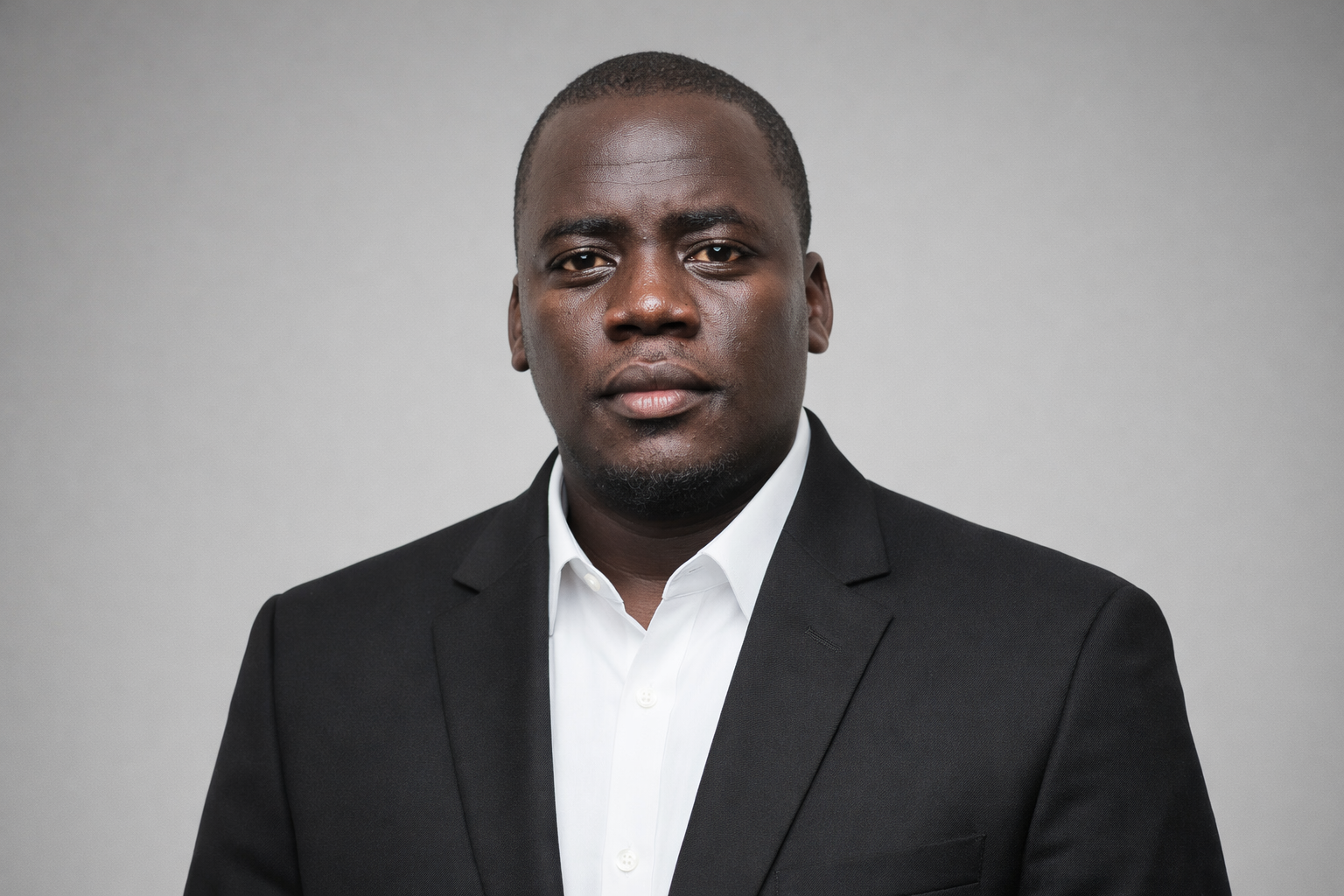
Cliford Otieno
Managing Director
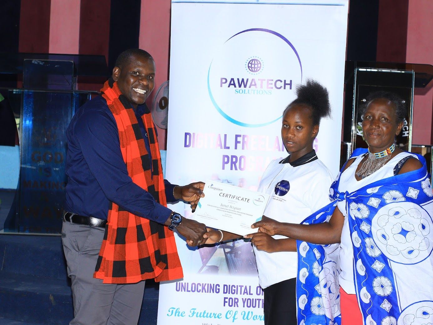
As Managing Director of Pawatech Solutions, I firmly believe technology is only truly powerful when it creates meaningful opportunity. Our purpose is to bridge the gap between talent and access by equipping individuals, businesses, and communities with practical digital skills, modern tools, and future-ready mindsets in a rapidly evolving world where staying relevant is essential.
We go beyond traditional training by emphasizing mentorship, real-world application, and job linkages so that every skill learned leads to income, growth, or transformation. From digital literacy and social media management to graphic design and AI-powered solutions, our programs are designed for measurable impact.
As a proudly Kenyan-founded organization, we are deeply committed to empowering youth, freelancers, and underserved communities not just to participate in the digital economy, but to thrive in it, while working with SMEs, institutions, and development partners to build inclusive, ethical, and sustainable pathways into the future of work.
— Cliford Otieno, Managing Director
Team
Our Expert Team
Meet the dedicated professionals driving innovation at Pawatech Solutions
Paul Munyaka
Training Coordinator Web development
Rufinus Ngasi
Training Coordinator Digital Freelancing Program
Juliana Ouko
Hr Manager Pawatech Solutions
Cliford Otieno
Director Pawatech Solutions
Enock Nzioka
Training Coordinator Coding and Robotics
/* ============================================
ABOUT PAGE — COMPREHENSIVE MOBILE STYLES
============================================ */
@media (max-width: 767px) {
.rs-breadcrumbs { min-height: 160px !important; padding: 50px 15px !important; }
.rs-breadcrumbs .page-title { font-size: 26px !important; line-height: 1.3 !important; }
.rs-breadcrumbs ul li { font-size: 13px !important; }
}
@media (max-width: 768px) {
.rs-about .sec-title .title, .sec-title2 .title { font-size: 24px !important; line-height: 1.3 !important; }
.rs-about .sec-title .desc, .director-message p { font-size: 15px !important; line-height: 1.75 !important; }
.rs-about .col-lg-6.pl-60 { padding-left: 15px !important; }
.rs-about .rs-animation-shape .images img { border-radius: 10px; width: 100%; height: auto; margin-bottom: 20px; }
.rs-about .row .col-lg-6 { margin-bottom: 25px; }
.mission-box, .vision-box { padding: 28px 22px !important; min-height: auto !important; margin-bottom: 20px; }
.mission-box h3, .vision-box h3 { font-size: 22px !important; }
.mission-box p, .vision-box p { font-size: 14.5px !important; }
.mission-box .icon-part i, .vision-box .icon-part i { font-size: 45px !important; }
.director-message { padding: 25px 20px !important; margin-top: 20px; }
.director-message .fa-quote-left { font-size: 28px !important; }
.director-image img { width: 180px !important; height: 180px !important; }
}
/* ============================================
TEAM CAROUSEL NAV — HIDE ON DESKTOP/TABLET
Show + style ONLY on phones (<= 767px)
============================================ */
/* Hide nav on everything above mobile */
@media (min-width: 768px) {
.team-carousel .owl-nav { display: none !important; }
.team-carousel .owl-dots { display: block !important; }
}
/* Mobile phones only */
@media (max-width: 767px) {
/* Hide dots — replaced by nav arrows */
.team-carousel .owl-dots { display: none !important; }
/* Ensure container handles absolute positioning */
.team-carousel { position: relative !important; }
/* Nav wrapper */
.team-carousel .owl-nav {
position: absolute !important;
top: 40% !important; /* Slightly above center to align with image */
left: 0 !important;
right: 0 !important;
transform: translateY(-50%) !important;
width: 100% !important;
margin-top: 0 !important;
pointer-events: none !important; /* Let clicks pass through empty space */
z-index: 10 !important;
}
/* Nav buttons */
.team-carousel .owl-nav .owl-prev,
.team-carousel .owl-nav .owl-next {
pointer-events: auto !important; /* Re-enable clicks */
width: 48px !important;
height: 48px !important;
border-radius: 50% !important;
background: linear-gradient(135deg, #03228f 0%, #106eea 100%) !important;
border: none !important;
outline: none !important;
cursor: pointer !important;
display: inline-flex !important;
align-items: center !important;
justify-content: center !important;
box-shadow: 0 6px 22px rgba(3, 34, 143, 0.38) !important;
transition: transform 0.22s ease, box-shadow 0.22s ease !important;
padding: 0 !important;
position: absolute !important;
}
.team-carousel .owl-nav .owl-prev { left: -10px !important; }
.team-carousel .owl-nav .owl-next { right: -10px !important; }
/* Icon injected via JS — target the
we'll add */
.team-carousel .owl-nav .owl-prev i,
.team-carousel .owl-nav .owl-next i {
font-size: 19px !important;
color: #ffffff !important;
line-height: 1 !important;
}
/* Hide the raw ‹ › span */
.team-carousel .owl-nav .owl-prev span,
.team-carousel .owl-nav .owl-next span {
display: none !important;
}
/* Hover */
.team-carousel .owl-nav .owl-prev:hover,
.team-carousel .owl-nav .owl-next:hover {
transform: scale(1.13) !important;
box-shadow: 0 10px 30px rgba(16, 110, 234, 0.48) !important;
}
/* Tap feedback */
.team-carousel .owl-nav .owl-prev:active,
.team-carousel .owl-nav .owl-next:active {
transform: scale(0.94) !important;
}
/* Disabled */
.team-carousel .owl-nav .disabled {
opacity: 0.35 !important;
pointer-events: none !important;
}
/* Card image on mobile */
.rs-team .team-item .team-img img {
height: 270px !important;
object-fit: cover !important;
}
.team-item-slide { padding: 0 4px; }
}
/* Extra small (≤ 480px) */
@media (max-width: 480px) {
.rs-about .sec-title .title, .sec-title2 .title { font-size: 20px !important; }
.mission-box, .vision-box { padding: 22px 18px !important; }
.director-message { padding: 20px 15px !important; border-left-width: 3px !important; }
.director-image img { width: 150px !important; height: 150px !important; }
.team-carousel .owl-nav .owl-prev,
.team-carousel .owl-nav .owl-next { width: 46px !important; height: 46px !important; }
.team-carousel .owl-nav .owl-prev i,
.team-carousel .owl-nav .owl-next i { font-size: 16px !important; }
}